
N E O P E T S S H O P W I Z A R D
Modern ease, classic feel.
This redesign of the Neopets Shop Wizard focuses on improving usability and efficiency while preserving the nostalgic look and feel that long-time players know and love.


T H E P R O B L E M
Clients struggle to get a clear sense of an agent’s experience and personality without a dedicated website, making it harder to build trust and connect directly.

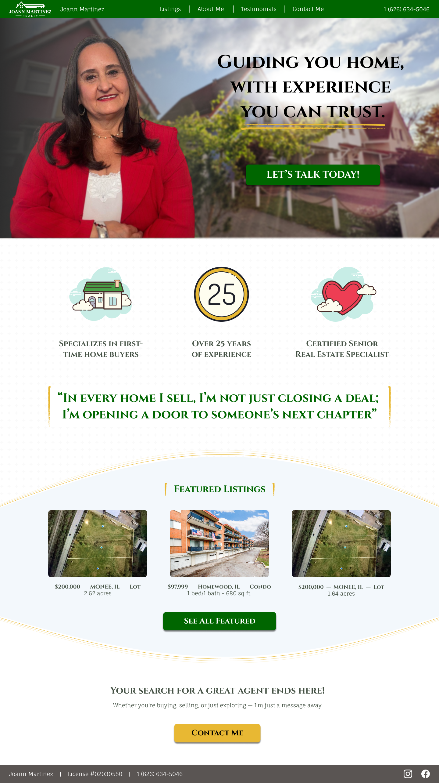
WARM WELCOME
Approachable and inviting, the homepage introduces clients to the agent’s personality and highlights what sets her apart.
T H E S O L U T I O N


PROPERTY SHOWCASE
Organized to spotlight featured homes with clear photos and details, giving clients an easy way to explore options at a glance.


TRUSTED EXPERIENCE
Sharing decades of expertise and personal background builds credibility while helping clients feel confident in their choice.

EASY INQUIRIES
A straightforward contact form ensures potential clients can quickly reach out and start a conversation without hassle.

T H E B A C K G R O U N D & R E S E A R C H
Agents without sites struggle to stand out in a crowded market.
This project was created to help an experienced real estate agent build a stronger online presence. With decades of expertise and licenses across multiple states, she had the knowledge and credibility but lacked a dedicated space to share it.
Many agents depend on word of mouth or third-party platforms, which makes it harder for clients to connect and build trust. This site provides a direct, approachable, and professional way to highlight her experience, showcase properties, and simplify how potential clients reach out.
Learning from lived experiences
To better understand the needs of potential clients and the market, I conducted both competitor research and user interviews.
The competitive analysis revealed how other agents present themselves online, highlighting gaps in approachability, personality, and trust-building. Interviews with prospective & previous buyers uncovered what clients look for in an agent’s site, from clear property details to an easy way to make contact.
Together, these insights provided a foundation for shaping the site’s structure and ensuring it communicated both professionalism and personality.
Competitive Analysis
The three competitors I researched and key insights I discovered:
Strengths:
Established reputations and strong client trust (luxury, urban, or community-focused).
Deep market knowledge and personalized service.
High-value credentials, sales recognition, or brokerage support.
Tailored approaches for different audiences (elite buyers, investors, first-time buyers).
Opportunities:
Rising demand for digital-first tools (3D tours, virtual showings, predictive pricing).
Growing interest from younger, mobile-first buyers seeking education and guidance.
Expanding migration patterns (urban to suburban, remote workers relocating).
Increasing value placed on transparency, speed, and eco-friendly homes.

Weaknesses:
Outdated or less polished visual design on some sites.
Limited digital tools (search filters, calculators, virtual tours).
Few dynamic updates (blogs, SEO, video walkthroughs).
Solo-agent models with minimal team or marketing presence.
Threats:
Intense competition from larger agencies and tech-savvy brokerages.
Economic pressures (rising interest rates, affordability challenges).
Regulatory changes in housing policy and zoning.
Overreliance on individual agents’ personal brands, limiting scalability.


User Interviews
Through 5 virtual interviews with clients of varying real estate agent experience I identified the following insights:
User Priorities:
Filters for price, bedrooms, and location are top needs.
High-quality photos are essential.
Clear navigation and listing clarity matter.
Neighborhood knowledge (safety, walkability, proximity, quiet) is extremely important.
Engagement Factors:
Local expertise and niche experience (first-time buyers, downsizing, etc.) build credibility.
Testimonials and relatable success stories strongly influence trust.
Users prefer approachable, professional profiles (not overly salesy).
Quick, clear, and responsive communication is a must.
Contact forms should be simple (name, email, budget/area, short message).
Pain Points:
Renters encounter unreliable platforms (ghosting, unresponsive agents).
Owners face information overload with too many or unclear results.
Stress comes from unclear processes and delayed responses.
Key Insights:
Visuals: High-quality photos are essential, with virtual tours as a helpful bonus.
Trust: Agents earn confidence through local expertise, testimonials, and authentic communication.
Communication: Fast, clear responses and simple, respectful contact forms are critical.
Specialization: Clients value agents who understand their specific situations, not just locations.
Neighborhood Context: Guides and social media previews help clients explore areas remotely.


T H E P E R S O N A S
Personas that guide decisions
Taking what I learned from the competitor analysis and user interviews, I created three unique user personas to make sure all ranges of users were covered.


Meet Maria!
Maria is ready to move from a larger family home into something quieter and more manageable.
She values simplicity and respect in the process, avoiding tech-heavy tools or agents who feel pushy.
Meet Lena!
Lena is a young professional navigating homeownership for the first time.
She wants approachable guidance and clear, simple listings that help her feel informed without being overwhelmed.
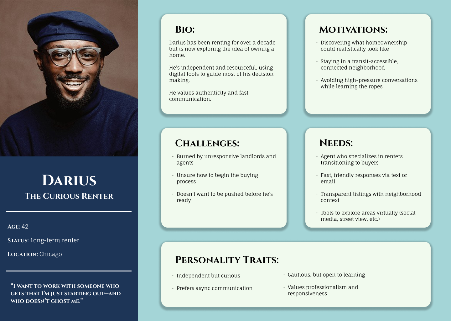
Meet Darius!
Darius has rented for years but is now exploring the idea of buying.
He values authenticity and quick, transparent communication from an agent who can guide him without pressure.
H O W M I G H T W E
How might we streamline the contact process to make it faster and more inviting for potential property buyers to reach out?
How might we showcase agent credibility and empathy to encourage users to initiate the communication process?

T H E I D E A T I O N
User needs, step by step
With our personas made and an idea of what users want, I created a user flow based on the key insights from the research phase. Due to the site’s intentional simplicity (and the fact that other flows needed to link out to third party sites) I decided against making more than one flow or a sitemap as the entire site was only a small handful of screens.
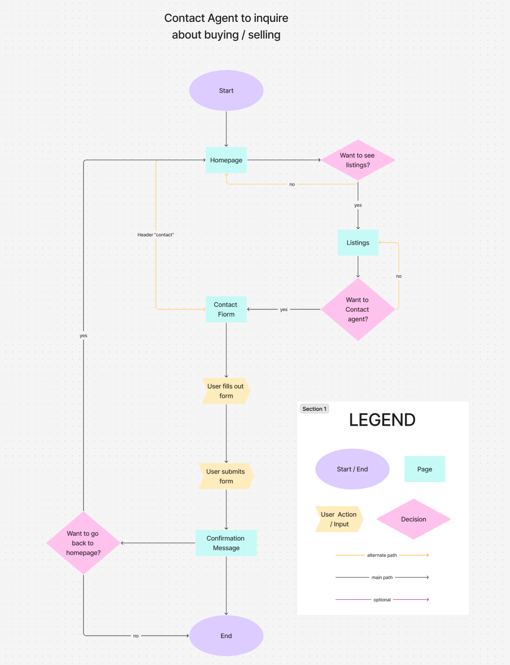
Contact the agent
Users can quickly fill out a simple, respectful contact form that avoids unnecessary fields and overwhelming detail. This flow emphasizes accessibility and trust, ensuring the process feels personal, straightforward, and stress-free while encouraging confident first steps in the buying journey.


T H E D E S I G N
Form guided by function
After creating our site map and user flows I began to start designing the key screens. Catering to my client’s vision was integral to the project so instead of the typical low-fidelity sketches I normally do I decided to start with more of a mid-fidelity stage so that it was easier for my client to interpret and imagine at the final stage.
Low-Mid fidelity Prototypes
Building trust through visual harmony


-
I designed a system of reusable components to create consistency across the site and make navigation effortless. Buttons, forms, and listing cards were built with clear interaction states to reduce friction for users. Call-to-action modules and icons highlight key services while flexible card layouts adapt to showcase listings, testimonials, and messages. By focusing on reusability and clarity, the components provide both structure and scalability, ensuring the site feels cohesive and easy to use.
-
Cinzel was selected for headers to convey professionalism and timelessness, giving the site a sense of trust and authority. For body text, Fauna One was chosen for its readability and approachable tone, ensuring users can comfortably scan through property details, forms, and testimonials. Together, these typefaces create a balanced visual hierarchy that supports both clarity and brand personality.
-
The color palette was chosen to balance professionalism with approachability while aligning with the branding of the real estate company the agent is associated with. Primary tones build trust and reliability, while accent colors draw attention to calls-to-action and key details without overwhelming the layout. This consistent use of color not only guides users through the site but also strengthens brand recognition.
-
The logo was outsourced due to the importance of the project and it being used to represent the client’s career and identity. The client sent me a few ideas she had and I passed the information along with a couple of rudimentary sketches and was given the final product back (which the client was very pleased with)

T H E T E S T I N G & I T E R A T I O N S
Shaping design through feedback
After some user testing, the mid-fidelity frames were brought up to high-fidelity and then tested again through virtual moderated usability tests with five interviewees to test the key flow. Participants were asked to complete the following tasks while providing comments and feedback along the way:
Based on the participant feedback I received during the usability tests, a handful of iterations were implemented into the final design. Including, but not limited to, the following:

From the homepage, get to featured listings and click on a home the user likes.
Find the about me page, and submit a contact form from there.
Locate the testimonials page and find the “view all listings” button

included property type labels as well as fixed the visibility of the "see all listings" button

visual elements were added to the listing cards, "more info" button was made more visible, and property type labels were added to description.

wording on form labels were adjusted, a clearer confirmation message was included when submitting, and a callback radio button option was included.

"view all listings" button was made properly sticky and placement was adjusted. Visual elements and testimony dates were added.


T H E R E S U L T S
From research to delivery, this project focused on building clarity for users while reflecting the agent’s personality.
It pushed me to adapt my process, balance client needs with user expectations, and design a site that feels approachable yet professional.
The final design resulted in a website that not only gave the agent a professional online presence but also made it easy for clients of all ages to navigate, explore listings, and get in touch. By prioritizing clarity and simplicity, the site conveys trust while still reflecting the agent’s personality.
This project reinforced the importance of adapting my design process to fit both user needs and client expectations. Early on, I underestimated how highly users valued brevity and concise content. Once uncovered, that insight reshaped the layout and copy, ensuring the site felt approachable rather than overwhelming. I also learned how crucial it is to validate assumptions with both users and clients, as features that might seem minor at first, like a low-commitment contact form, often carry the most weight in real use.
Looking back, I would expand testing with a broader set of users, including first-time homebuyers and older clients, to see how the design performs across different comfort levels with technology. With more time, I would also explore adding optional features like mortgage calculators or comparison tools, provided they could be implemented without cluttering the site.
I am most proud of how well the design balances usability with personality. Despite the project’s simplicity, the final product reflects both the voice of the client and the needs of their users. More importantly, it demonstrates my ability to manage client communication, iterate thoughtfully, and design for clarity.
This project highlights my end to end skills, from research and synthesis to branding, design, prototyping, and testing, and shows that I can create solutions that are not only visually polished but also grounded in real user needs.