
C H R O N I C L E
Your Media. Your Way.
A mobile media logging app designed to help you track, organize, and share everything you consume in one seamless space.

T H E P R O B L E M
People struggle to keep track of all the media they consume across different platforms, making it difficult to organize, reflect, and share their experiences.
INTUITIVE DASHBOARD

Prioritizing what’s important to you, the media, Chronicle
makes sure to highlight your watchlist and friend activity before
anything else.
T H E S O L U T I O N
CUSTOM COLLECTIONS

Collections are a way for users to not only organize their media
but also showcase their tastes. Expressing yourself should never
be difficult, and neither should
EFFORTLESS SEARCH

With the ability to simply search all media or further narrow by
media type, users will always be confident they’re able to find
what they want.
LOG MEDIA YOUR WAY

Chronicle is all about letting users keep track of things how in
the way that works for them. When logging, everything is
completely optional so that your reviews are exactly that; yours.
T H E B A C K G R O U N D
Media apps focus on one format, leaving logging fragmented.
Chronicle is built for all media lovers. Whether you want to consume, reflect, keep track, or share, it adapts to your needs.
Many platforms are overwhelming, cluttered, or too rigid, which discourages consistent use.
Chronicle offers a streamlined and customizable tool that gives users ownership of how they log and reflect while keeping the process simple and enjoyable.
T H E R E S E A R C H
Grounded in real voices.
To better understand the landscape and user needs, I conducted both competitive analysis and user interviews.
The SWOT analysis helped identify gaps and opportunities within existing media logging platforms, while interviews revealed real user pain points, motivations, and behaviors.
Together, these methods provided a strong foundation for shaping Chronicle’s features and ensuring they aligned with both market demands and user expectations.
Competitive Analysis
The three competitors I researched and key insights I discovered:
Letterboxd
Strengths:
Loyal and engaged user bases within their niches.
Strong logging and review tools that make tracking media simple.
Communities built around shared interests with user-generated content and recommendations.
Established databases and partnerships (e.g., film industry, streaming sites, indie gaming communities).
Clean, user-friendly interfaces that encourage journaling and list creation.
Opportunities:
Rising interest in personal media journaling and social discovery.
Growing demand for cross-media and mobile-first tracking tools.
Expanding communities in indie gaming, international films, and anime/manga fandoms.
Desire for customizable profiles, personalized stats, and collaborative lists.
New possibilities through integrations with streaming and gaming platforms.
Backloggd
Anime-Planet
Weaknesses:
Limited scope, each focusing only on one media type.
Outdated or clunky UX in places, especially on mobile.
Gaps in personalization and discovery features.
Weak integration with external platforms and poor syncing options.
Inconsistent databases, especially for indie or niche titles.
Limited monetization strategies and restricted features for free users.
Threats:
Competition from large ecosystems (e.g., Steam, Xbox, IMDb, MyAnimeList).
Streaming services building their own recommendation and logging systems.
Challenges in monetizing without alienating loyal users.
Risk of losing younger, mobile-first audiences if platforms do not modernize.
Heavy reliance on third-party data sources.
User Intervierws
Through 5 virtual interviews with people of varying media tracking habits I identified the following insights:
Habits & Motivations:
Users consume multiple media types (anime, movies, shows, music, games, manga).
Tracking helps with memory, organization, and personal satisfaction.
Stats and trends are “nice to have” but not essential.
Most prefer private journaling with optional profile sharing and selective social features.
Features & Preferences:
One unified app for all media types.
Quick-add and minimal-step logging.
Integrations with apps/streaming platforms for auto-tracking.
Customizable organization (tags, lists, genres, moods, favorites).
Import/export tools, calendar for releases, and support for niche titles.
Optional reminders, but only sparingly or at onboarding.
Pain Points & Frustrations:
Fragmentation across multiple platforms makes tracking tedious.
Logging past media and onboarding feels like too much effort.
Manual updates and too many steps deter consistency.
Poor mobile optimization, missing niche titles, and outdated UIs frustrate users.
Key Design Principles:
Consolidation: A single hub for multi-type media.
Speed: Quick, low-friction logging is critical.
Customization: Flexible categorization and filtering tools.
Accessibility: Mobile-friendly, uncluttered UI with dark mode.
Simplicity: Reduce onboarding with bulk-add, imports, and integrations.
Optional Social Layer: Keep core experience private-first, with optional sharing, reviews, and friend-based recommendations.
T H E P E R S O N A S
From interviews to identities
Taking what I learned from the competitor analysis and user interviews, I created three unique user personas to make sure all ranges of users were covered.


Meet Jamie!
Jamie enjoys media in bursts and values convenience above all.
They want a simple, low-effort way to log and recall what they’ve watched without dealing with clunky or time-consuming processes.
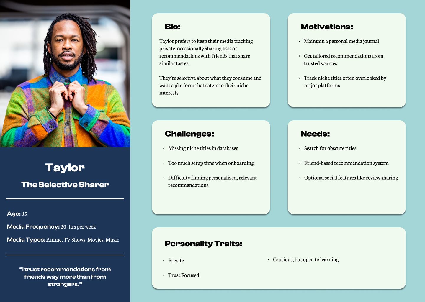
Meet Taylor!
Taylor prefers to keep media tracking private, only sharing with trusted friends who have similar tastes.
They’re focused on niche titles and want a platform that balances privacy with selective sharing.
Meet Alex!
Alex is a detail-oriented media enthusiast who thrives on organization.
They rely on spreadsheets and multiple apps but are searching for a single, customizable tool that can handle everything in one place.
H O W M I G H T W E
How might we make it quick and intuitive for users to update their progress across multiple formats?
How might we encourage users to log more media by connecting recommendations to what they’ve already logged?
How might we design engaging social features that make media logging feel collaborative rather than solitary?
T H E I D E A T I O N
From interviews to identities
Taking what I learned from the competitor analysis and user interviews, I created three unique user personas to make sure all ranges of users were covered.