
C H R O N I C L E — UX/UI Designer
Your Media. Your Way.
A mobile media logging app designed to help you track, organize, and share everything you consume in one seamless space.
T H E P R O B L E M
People struggle to keep track of all the media they consume across different platforms, making it difficult to organize, reflect, and share their experiences.
T H E S O L U T I O N
Prioritizing what’s important to you, the media, Chronicle makes sure to highlight your watchlist and friend activity before anything else.
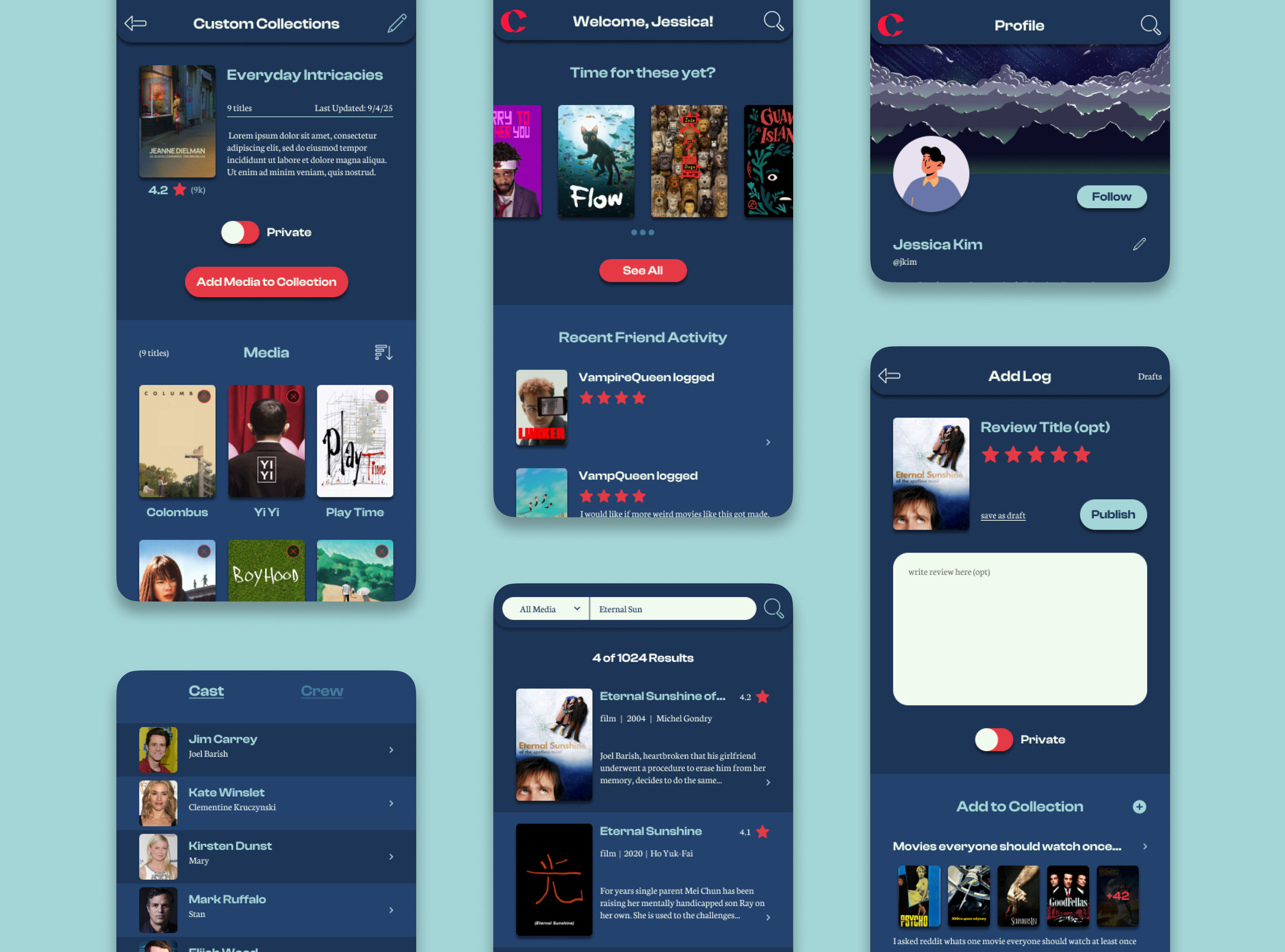
Intuitive Dashboard
Collections are a way for users to not only organize their media but also showcase their tastes. Expressing yourself should never be difficult.
Custom Collections
With the ability to simply search all media or further narrow by media type, users will always be confident they’re able to find what they want.
Effortless Search
Chronicle is all about letting users keep track of things how in the way that works for them. When logging, everything is optional so that your reviews are exactly that; yours.
Log Your Media Your Way
T H E B A C K G R O U N D & R E S E A R C H
Chronicle is built for all media lovers. Whether you want to consume, reflect, keep track, or share, it adapts to your needs.
Many platforms are overwhelming, cluttered, or too rigid, which discourages consistent use.
Chronicle offers a streamlined and customizable tool that gives users ownership of how they log and reflect while keeping the process simple and enjoyable.
Media apps focus on one format, leaving logging fragmented.
To better understand the landscape and user needs, I conducted both competitive analysis and user interviews.
The SWOT analysis helped identify gaps and opportunities within existing media logging platforms, while interviews revealed real user pain points, motivations, and behaviors.
Together, these methods provided a strong foundation for shaping Chronicle’s features and ensuring they aligned with both market demands and user expectations.
Grounded in real voices.
Competitive Analysis
Strong, loyal user base and elegant UI
Trusted film partnerships and visibility in film communities
Excellent UX for list creation, logging, and discovery
Robust social features and community engagement
Strengths
Limited to films (no TV shows or other media)
Free tier lacks advanced stats
Weak rewatch logging and personalization
Poor integration with other platforms
Weaknesses
Film journaling trend growing
Social media driving film discussion
Rising indie and international film streaming
Potential for mood-based recs, creator tools, and TV integration
Opportunities
Competing with streaming service ecosystems
User retention as others offer integrated recommendations
Dependence on external databases
Threats

Niche “Letterboxd for games” appeal
Simple, journal-like tracking for gamers
Rapid feedback response and community focus
Social feeds and backlog progress tools
Strengths
No mobile app
Weak filtering/sorting
Missing platform synch (Steam/Xbox/PS)
Limited personalization and inconsistent data for indie titles
Weaknesses
Growing indie gaming scene
Social journaling and habit tracking on the rise
Demand for platform synching, achievements, and accessibility metadata
Opportunities
Competition from native gaming platforms (Steam, Xbox, PS)
Need to monetize sustainably
Fragmented ecosystems and content duplication
Threats

Longstanding anime/manga database
Trusted community and rich metadata
Dual anime + manga support
Integrations with Crunchyroll and streaming sites
Strengths
Outdated UI and navigation
Weak mobile experience
Limited social tools and moderation
No premium monetization model
Weaknesses
Rising global interest in anime/manga
Expanding to light novels or dramas
Mobile journaling and aesthetic-based discovery
Younger audiences looking for faster, social-first tools.
Threats
Aggressive competition (MyAnimeList, AniList)
Risk of data loss during redesign
Falling behind on mobile-first standards
Reliance on aging infrastructure and forums.
Opportunities
User Interviews
Users consume multiple media types (anime, movies, shows, music, games, manga)
Tracking helps with memory, organization, and personal satisfaction
Stats and trends are “nice to have” but not essential
Most prefer private journaling with optional profile sharing and selective social features
Behavior
Fragmentation across multiple platforms makes tracking tedious
Logging past media and onboarding feels like too much effort
Manual updates and too many steps deter consistency
Poor mobile optimization, missing niche titles, and outdated UIs frustrate users
Frustrations
One unified app for all media types
Quick-add and minimal step logging
Integrations with apps/streaming platforms for auto-tracking
Customizable organization (tags, lists, genres, moods, favorites)
Import/export tools, calendar for releases, and support for niche titles
Optional reminders, but only sparingly or at onboarding
Preferences
Consolidation: A single hub for multi-type media
Speed: Quick, low-friction logging is critical
Customization: Flexible categorization and filtering tools
Accessibility: Mobile-friendly, uncluttered UI with dark mode
Simplicity: Reduce onboarding with bulk-add, imports, and integrations
Optional Social Layer: Keep core experience private-first with optional sharing, reviews, and friend-based recommendations.
Key Principles
T H E P E R S O N A S
Taking what I learned from the competitor analysis and user interviews, I created three unique user personas to make sure all ranges of users were covered.
From interviews to identities
Meet Jamie!
Jamie enjoys media in bursts and values convenience above all.
They want a simple, low-effort way to log and recall what they’ve watched without dealing with clunky or time-consuming processes.
Meet Taylor!
Taylor prefers to keep media tracking private, only sharing with trusted friends who have similar tastes.
They’re focused on niche titles and want a platform that balances privacy with selective sharing.
Meet Alex!
Alex is a detail-oriented media enthusiast who thrives on organization.
They rely on spreadsheets and multiple apps but are searching for a single, customizable tool that can handle everything in one place.
H O W M I G H T W E
How might we make it quick and intuitive for users to update their progress across multiple formats?
How might we encourage users to log more media by connecting recommendations to what they’ve already logged?
How might we design engaging social features that make media logging feel collaborative rather than solitary?
T H E I D E A T I O N
With our personas made and an idea of what users want, I create a site map to solidify ideas on how the app would be navigated and then designed a trio of user flows (one catered to each user persona) based on key insights
Blueprints for better journeys
-
The dashboard acts as the central hub where users can access their queue, trending content, and recent friend activity. It balances personal tracking with a snapshot of what friends are engaging with.
-
This section focuses on connection, offering a social feed, groups, and challenges. It gives users the option to participate in community-driven engagement without making it the core experience.
-
Here users can add, edit, and manage logs, as well as view their history through a calendar. This feature ensures consistency and helps users easily track their media consumption over time.
-
Discovery tools highlight recommendations, friend suggestions, categories, groups, and challenges. The goal is to expand exploration while keeping recommendations relevant and user-driven.
-
Profiles showcase activity, reviews, collections, achievements, and optional goals or stats. Settings for account preferences, privacy, moderation, and accessibility give users full control over their experience.
-
Search is always accessible from the top right of the app, allowing users to look up media titles, users, tags, groups, and collections. Filters like media type, genre, rating, and release date refine results for faster navigation.
Shows how users create a new log entry by selecting or searching for media, then optionally adding tags, ratings, or reflections. Users can save drafts privately or publish entries to share. Designed to reduce friction which supports both quick and deeper reflection logging styles.
Add a media log
Demonstrates how users can quickly search for a media title, apply filters if needed, and add it to their queue. The process prioritizes efficiency and flexibility, ensuring users can find content fast and save it for later without unnecessary steps.
Search & Add to watchlist
Walks through building a custom collection or list. Users can set a title, description, and privacy preferences, then add media with tags or moods for personalization. Also highlights Chronicle’s emphasis on user ownership and customization, allowing media to be sorted and published in a way that fits each user’s style.
Create a collection
T H E D E S I G N
After creating our site map and user flows I began to start sketching key screens. Starting with any idea I had first and then narrowing it down by matching user needs and referencing my sitemap/user flows.
The real magic begins to show during the mid-fidelity stages, where I refine the hierarchy and layout further to make it more readable for our eventual user testing.
Where ideas become tangible
Low fidelity Prototypes
Mid fidelity Prototypes
Chronicle is built around four central themes that guided its design:
Ownership & Customization, giving users the freedom to shape how they log and display their media;
Simplicity & Clarity, ensuring the interface reduces friction so tracking feels seamless rather than like a chore; Meaningful Engagement, encouraging reflection, discovery, and interactions that add depth beyond just logging;
Community & Connection, allowing optional social layers where sharing, recommendations, and encouragement enhance the experience without overwhelming those who prefer to keep things private.
Together, these themes balance functionality with personalization, creating a platform that feels intentional, intuitive, and rewarding.
Crafting identity through visuals
Chronicle’s brand identity was designed to feel modern, approachable, and highly adaptable.
The name emphasizes storytelling and memory, highlighting the idea of capturing and organizing personal media journeys.
Its palette blends soft neutrals with accent colors that bring warmth and contrast, creating a clean foundation that avoids visual clutter.
The logo uses a subtle “page-turning C” motif, reinforcing the idea of unfolding stories while remaining minimal enough for versatile use across the app.
Typography pairs a friendly, rounded headline font with a crisp, legible body type, balancing personality with readability.
Finally, the UI elements follow a lightweight, modular style with rounded cards, clear iconography, and thoughtful spacing, ensuring the interface feels intuitive, consistent, and inviting.
T E S T I N G & I T E R A T I O N S
After bringing the mid-fidelity frames up to high-fidelity I hosted a virtual moderated usability test with five interviewees to test the key flows. Interviewees were asked to complete the following tasks while providing comments and feedback along the way:
Learning from every click
Search for the movie “Eternal Sunshine of the Spotless Mind” and add it to your watchlist
Find and create a new custom collection
Add a log for the movie “Eternal Sunshine of the Spotless Mind”
Tasks
Search: Functional, but some data improvements needed.
Collections: The biggest usability pain point → unclear entry point, need for privacy, and more customization.
Logging: Well-received, but optionality must be clearer and a quick-log option is essential.
Overall: Users like the consolidated experience, but expect privacy, integrations, and customization to make the app feel competitive.
Key Takeaways
T H E R E S U L T S
From research through testing, every decision in Chronicle was shaped by user feedback and the goal of making media logging simpler while adding value through reflection and organization.
It’s critical it is to validate assumptions early. Features I initially thought would be central, like ratings, proved to be secondary, while reflections emerged as the true differentiator. Testing at different fidelity levels also proved valuable, as users offered unique insights when evaluating rough sketches compared to polished prototypes.
What I Learned
I would have expanded the participant pool to include more diverse media consumers, such as those who primarily track books or games, to better understand how Chronicle scales across formats. With more time, I would also prototype and test community features more deeply, including commenting, reactions, and group collections, as well as build out data visualization for “Year in Review” insights since participants showed strong interest in seeing patterns over time.
Looking Back
I’m most proud of how well the final design reflects the voices of the users I interviewed. Chronicle not only looks good but it directly addresses the frustrations people shared. Building something intentional, personal, and genuinely useful is what excites me most as a designer.
This project demonstrates my ability to take a concept from start to finish: research, synthesis, branding, design, prototyping, and testing. It shows I can create polished deliverables while grounding every decision in user input and highlights my ability to balance detail-oriented design with big-picture storytelling.
Project Takeaways