
R E A L E S T A T E — UX/UI Designer
By your side—from search to sold.
A modern real estate website built to showcase listings, highlight the agent’s personality, and make contacting simple and seamless.
T H E P R O B L E M
Clients struggle to get a clear sense of an agent’s experience and personality without a dedicated website, making it harder to build trust and connect directly.
T H E S O L U T I O N
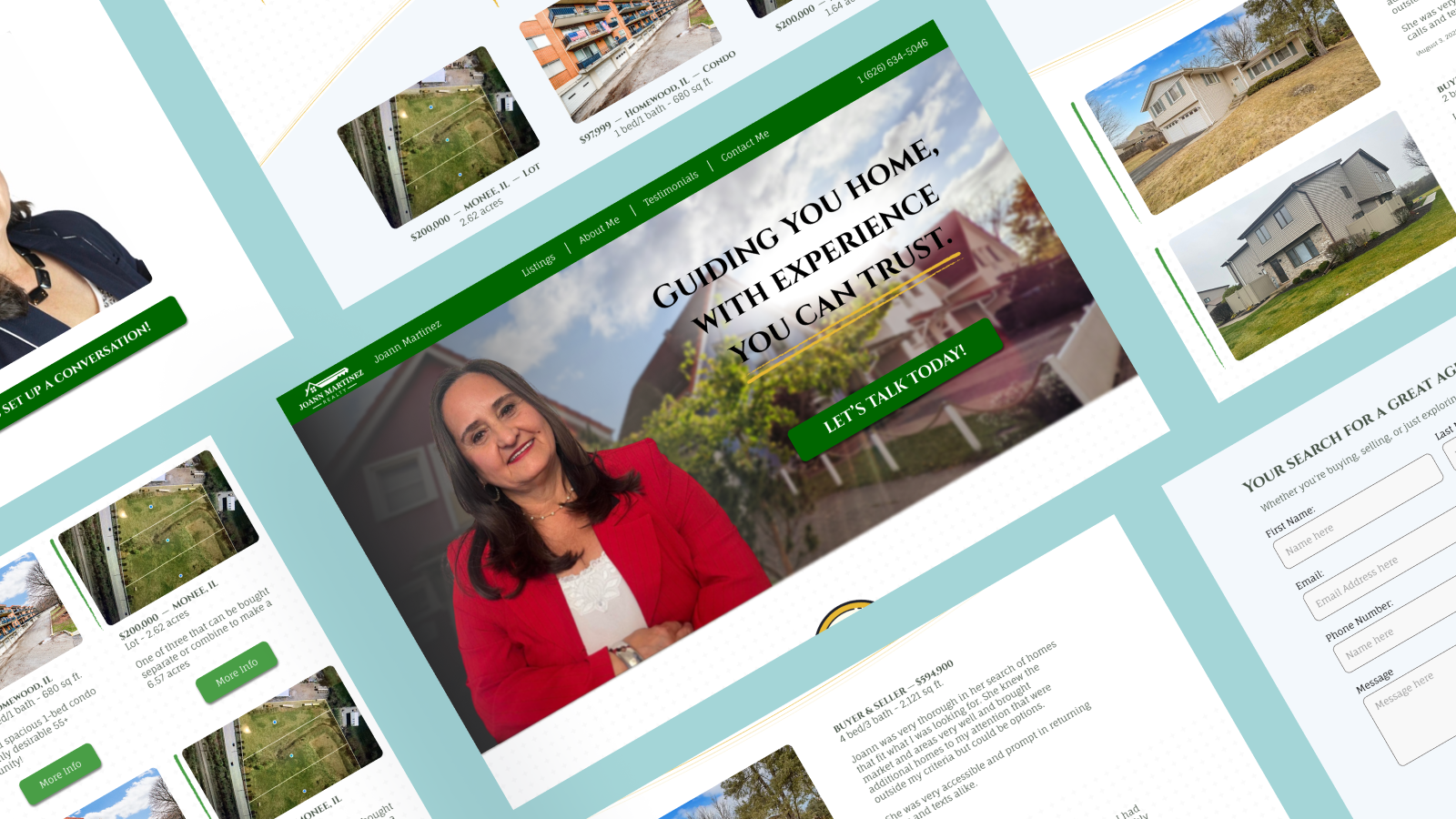
Approachable and inviting, the homepage introduces clients to the agent’s personality and highlights what sets her apart.
Warm Welcome
Organized to spotlight featured homes with clear photos and details, giving clients an easy way to explore options at a glance.
Property Showcase
Sharing decades of expertise and personal background builds credibility while helping clients feel confident in their choice.
Trusted Experience
A straightforward contact form ensures potential clients can quickly reach out and start a conversation without hassle.
Easy Inquiries
T H E B A C K G R O U N D & R E S E A R C H
This project was created to help an experienced real estate agent build a stronger online presence. With decades of expertise and licenses across multiple states, she had the knowledge and credibility but lacked a dedicated space to share it.
Many agents depend on word of mouth or third-party platforms, which makes it harder for clients to connect and build trust. This site provides a direct, approachable, and professional way to highlight her experience, showcase properties, and simplify how potential clients reach out.
Agents without sites struggle to stand out in a crowded market.
To better understand the needs of potential clients and the market, I conducted both competitor research and user interviews.
The competitive analysis revealed how other agents present themselves online, highlighting gaps in approachability, personality, and trust-building. Interviews with prospective & previous buyers uncovered what clients look for in an agent’s site, from clear property details to an easy way to make contact.
Together, these insights provided a foundation for shaping the site’s structure and ensuring it communicated both professionalism and personality.
Learning from lived experiences
Competitive Analysis
Deep community roots in Walnut Creek and East Bay
Approachable tone and relatable branding
Focuses on first-time buyers and families
Offers practical tools (mortgage calculator, guides, virtual showings)
Strengths
Outdated visual design and branding
No consistent blog or SEO strategy
Listings not clearly highlighted on site
Limited online interactivity or team visibility
Weaknesses
Continued migration from San Francisco to East Bay
Rising demand for affordable, family-friendly housing
Tools for remote closings, AI property matching, and buyer education apps
Opportunities
Competing with large digital broker teams in East Bay
Housing affordability pressures in California
Solo-agent model limits scalability and market reach
Threats
Top 1% agent with strong performance and credibility
Offers investor-focused programs and data-backed insights
Excellent market knowledge and transparency
Strong digital structure and lead generation flow
Strengths
Visual branding feels generic, lacks storytelling
Site heavily focused on buyers — little for sellers
Weak social media engagement for lead generation
Operates as a small or solo team
Weaknesses
Growing interest from international investors
Use of predictive pricing, data visualization, and dashboards for clients
Tech-forward features could set him apart in luxury market
Opportunities
Government policy and affordability issues may limit growth
Rising mortgage rates affecting mid-tier and entry-level clients
Competition from digital-first brokerages like Properly and Realosophy
Threats

Strong reputation in LA luxury real estate, trusted by celebrity and corporate clients
Specializes in high-value areas like Beverly Hills and Bel Air
Decades of experience with “white glove” personalized service
Deep network in entertainment and business circles
Strengths
Lacks interactive features (filters, calculators, tours)
Minimal online content and no blog (weak SEO)
No resources for first-time or international buyers
Limited digital presence and scalability as a solo agent
Weaknesses
Growing demand for privacy-first, high-end real estate
Rising relocation from tech and international clients
Use of 3D tours, AI tools, and concierge-style service to elevate digital luxury experience
Opportunities
Competitive LA luxury market dominated by large brokerages
Vulnerable to economic downturns and luxury market fluctuations
May lose younger buyers who expect more tech-savvy experiences
Threats
User Interviews
Filters for price, bedrooms, and location are top needs.
High-quality photos are essential.
Clear navigation and listing clarity matter.
Neighborhood knowledge (safety, walkability, proximity, quiet) is extremely important.
User Priorities
Renters encounter unreliable platforms (ghosting, unresponsive agents).
Owners face information overload with too many or unclear results.
Stress comes from unclear processes and delayed responses.
Pain Points
Local expertise and niche experience (first-time buyers, downsizing, etc.) build credibility.
Testimonials and relatable success stories strongly influence trust.
Users prefer approachable, professional profiles (not overly salesy).
Quick, clear, and responsive communication is a must.
Contact forms should be simple (name, email, budget/area, short message).
Engagement
Visuals: High-quality photos are essential, with virtual tours as a helpful bonus.
Trust: Agents earn confidence through local expertise, testimonials, and authentic communication.
Communication: Fast, clear responses and simple, respectful contact forms are critical.
Specialization: Clients value agents who understand their specific situations, not just locations.
Neighborhood Context: Guides and social media previews help clients explore areas remotely.
Key Insights
T H E P E R S O N A S
Taking what I learned from the competitor analysis and user interviews, I created three unique user personas to make sure all ranges of users were covered.
Personas that guide decisions
Meet Maria!
Maria is ready to move from a larger family home into something quieter and more manageable.
She values simplicity and respect in the process, avoiding tech-heavy tools or agents who feel pushy.
Meet Lena!
Lena is a young professional navigating homeownership for the first time.
She wants approachable guidance and clear, simple listings that help her feel informed without being overwhelmed.
Meet Darius!
Darius has rented for years but is now exploring the idea of buying.
He values authenticity and quick, transparent communication from an agent who can guide him without pressure.
H O W M I G H T W E
How might we streamline the contact process to make it faster and more inviting for potential property buyers to reach out?
How might we showcase agent credibility and empathy to encourage users to initiate the communication process?
T H E I D E A T I O N
With our personas made and an idea of what users want, I created a user flow based on the key insights from the research phase. Due to the site’s intentional simplicity (and the fact that other flows needed to link out to third party sites) I decided against making more than one flow or a sitemap as the entire site was only a small handful of screens.
User needs, step by step
Users can quickly fill out a simple, respectful contact form that avoids unnecessary fields and overwhelming detail. This flow emphasizes accessibility and trust, ensuring the process feels personal, straightforward, and stress-free while encouraging confident first steps in the buying journey.
Contact the agent
T H E D E S I G N
After creating our site map and user flows I began to start designing the key screens. Catering to my client’s vision was integral to the project so instead of the typical low-fidelity sketches I normally do I decided to start with more of a mid-fidelity stage so that it was easier for my client to interpret and imagine at the final stage.
Form guided by function
Low-Mid fidelity Prototypes
The real estate site’s visual identity was built to convey trust, professionalism, and warmth.
The palette combines clean neutrals with a bold accent color, striking a balance between sophistication and approachability.
The logo is simple yet memorable, designed to feel modern while reflecting the reliability clients look for in an agent.
Typography pairs a strong, elegant headline font with a clean, readable body type to ensure clarity across listings, forms, and testimonials.
The UI elements are streamlined and intuitive, using consistent spacing, clear buttons, and subtle hover states to guide users effortlessly through property searches, contact forms, and agent information.
Building trust through visual harmony
To make sure that our agent’s site is accessible to anyone, a mobile version was made as well to ensure it an be accessed from anywhere.
The client wanted the site to look as similar as possible to the desktop version to ensure brand consistency and avoid any confusion.
Responsive Mobile Design
T E S T I N G & I T E R A T I O N S
After some user testing, the mid-fidelity frames were brought up to high-fidelity and then tested again through virtual moderated usability tests with five interviewees to test the key flow. Participants were asked to complete the following tasks while providing comments and feedback along the way:
Shaping design through feedback
From the homepage, get to featured listings and click on a home the user likes.
Find the about me page, and submit a contact form from there.
Locate the testimonials page and find the “view all listings” button
Tasks
High-Priority Improvements
Improve CTA/button visibility (e.g., More Info, View All Listings)
Clarify listing details (unit vs. building, property type)
Possibly add FAQ or first-time buyer resources
Medium-Priority Enhancements
Add dates to testimonials or indicate how recent they are
Include a callback request option in the contact form
Add slight personality touches to About Me (casual photo, quote, etc.)
Key Takeaways
T H E R E S U L T S
From research to delivery, this project focused on building clarity for users while reflecting the agent’s personality.
It pushed me to adapt my process, balance client needs with user expectations, and design a site that feels approachable yet professional.
The final design resulted in a website that not only gave the agent a professional online presence but also made it easy for clients of all ages to navigate, explore listings, and get in touch. By prioritizing clarity and simplicity, the site conveys trust while still reflecting the agent’s personality.
This project reinforced the importance of adapting my design process to fit both user needs and client expectations. Early on, I underestimated how highly users valued brevity and concise content. Once uncovered, that insight reshaped the layout and copy, ensuring the site felt approachable rather than overwhelming. I also learned how crucial it is to validate assumptions with both users and clients, as features that might seem minor at first, like a low-commitment contact form, often carry the most weight in real use.
What I Learned
I would expand testing with a broader set of users, including first-time homebuyers and older clients, to see how the design performs across different comfort levels with technology. With more time, I would also explore adding optional features like mortgage calculators or comparison tools, provided they could be implemented without cluttering the site.
Looking Back
I am most proud of how well the design balances usability with personality. Despite the project’s simplicity, the final product reflects both the voice of the client and the needs of their users. More importantly, it demonstrates my ability to manage client communication, iterate thoughtfully, and design for clarity.
This project highlights my end to end skills, from research and synthesis to branding, design, prototyping, and testing, and shows that I can create solutions that are not only visually polished but also grounded in real user needs.
Project Takeaways